
Book Cover Color Psychology: Choose Colors That Signal Genre
Color reaches a reader before the title does. Use genre expectations, mood, contrast, and a small repeatable palette to make a cover feel right at a glance without copying another book.

What does color psychology do on a book cover?
It helps readers classify a book and feel its mood before they read the title. Color is not a universal code: shade, saturation, contrast, image, typography, and culture change the message. Treat color psychology as a decision framework, then test the complete cover with real readers.
Signal the shelf
A restrained palette can tell a thriller, romance, fantasy, or business reader that the cover belongs in the category they are browsing.
Set the mood
Warm, cool, bright, muted, dark, and soft colors change the emotional temperature before the story is explained.
Common book cover colors and the expectations they can create
These are starting points, not promises. A saturated red can mean passion or danger; a pale blue can feel calm or cold. Pair every color with the book's image, type, and subgenre before you decide.
| Color direction | Common signals | Where it often fits | Watch for |
|---|---|---|---|
| Red and crimson | Urgency, passion, danger, heat, power | Thriller, crime, horror, romance, action | Too much bright red can feel loud or generic; use a darker value or one controlled accent when the story needs sophistication. |
| Blue and navy | Trust, depth, calm, authority, isolation | Business, memoir, literary fiction, science fiction, mystery | Blue is common. Change temperature or add one distinctive accent so a serious cover does not disappear among similar titles. |
| Black and charcoal | Mystery, elegance, power, danger, restraint | Noir, thriller, horror, dark romance, literary fiction | Dark-on-dark type and low-value images vanish in a store grid. Build a clear light-dark relationship before adding texture. |
| Gold and warm metallics | Prestige, history, luxury, magic, achievement | Historical fiction, fantasy, romance, premium nonfiction | Metallic color works as an accent more reliably than a full background. Check that it still reads after compression or printing. |
| Green and teal | Nature, renewal, health, balance, unease | Wellness, environmental nonfiction, fantasy, speculative fiction | A neon green and a muted forest green tell very different stories. Saturation and the neighboring colors set the tone. |
Build a three-color palette before you open the editor
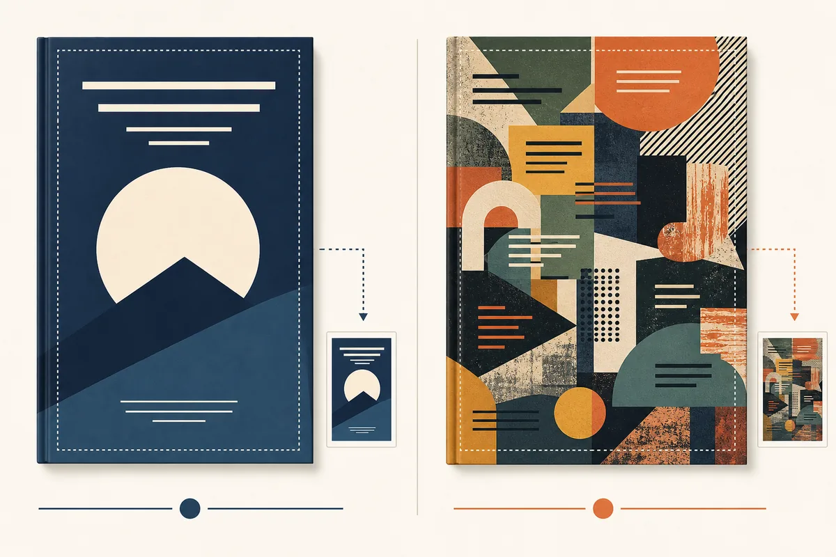
A dominant color sets the emotional temperature, a supporting color creates rhythm, and one accent directs attention. A three-color limit is not a law, but it makes decisions visible and prevents every new element from introducing another hue. Choose the palette from the exact subgenre and tone, not from a favorite color in isolation.
Start with the reader's shelf
Look at ten to twenty recent covers in the exact subgenre. Note the dominant hue, value range, and accent behavior. This is research into reader expectations, not an instruction to copy a bestselling cover.
Choose dominant, support, and accent
Let the dominant tone occupy most of the image, use a supporting tone for secondary shapes or texture, and reserve the accent for the focal point or a short title detail. Write down the three values before you add decoration.
Separate mood from readability
A moody background may be perfect for the story and still be a poor title zone. Move or simplify the art, then choose a text color with clear value contrast. Effects should refine contrast, not replace it.
Check culture and context
Color associations vary by country, age group, and lived experience. Treat genre conventions as clues. Ask readers in the market you serve what they expect, and avoid claiming that one color has one fixed meaning.
Match color to the promise, then add a deliberate difference
Genre is a useful first filter, but subgenre and tone matter more than a universal color chart. A cozy mystery, dark romance, and psychological thriller may all use red, yet their values, accents, and imagery will be different.
Romance
Warm reds, pinks, coral, cream, and gold can suggest intimacy. Bright contemporary romance often needs a lighter, cleaner treatment than dark romance, which may use black, burgundy, or metallic accents.
Thriller and crime
Near-black, deep blue, charcoal, white, and one sharp accent can create tension. Keep the focal point simple and check that the title remains bold when the cover is reduced.
Fantasy and paranormal
Jewel tones, violet, teal, emerald, and gold can imply wonder or magic. Use one memorable symbol or silhouette so a rich palette does not become a busy collage.


A six-step color workflow for a publishable cover
Use this sequence for an AI-generated concept, a template, or a designer handoff. It turns color psychology into decisions you can explain and revise.
Name the exact subgenre
Write the shelf, audience, and emotional promise in one sentence. Avoid choosing a palette until you know whether the book is cozy, dark, epic, practical, intimate, or playful.
Collect comparable covers
Save a small set of current covers from the same market. Record repeated colors, contrast patterns, and where titles sit. Look for a safe expectation and an opportunity to be recognizable.
Draft two palette routes
Make one route that fits the shelf and another that bends one convention. Keep the subject, title, and layout consistent so the color decision is what you are comparing.
Place type on the real art
Test title, author, subtitle, and series text before you call the palette finished. A color that looks beautiful in a swatch may fail behind a title or on a full wrap.
Check color where the cover will actually compete
Large previews flatter every design. Marketplaces, search results, social feeds, and mobile screens reduce the cover until color blocks and value contrast carry most of the message.
Shrink the full cover
Preview the complete front at listing size. The dominant color should still create a recognizable mood instead of becoming one gray or noisy shape.
Check value contrast
Convert a copy to grayscale. If title and background merge, change the value or move the title before adding glow, outline, or shadow.
Read the title first
Squint or step back. The title should arrive before a decorative texture, secondary badge, or tiny author line steals the contrast.
Fix the color decision before adding more decoration
Most palette problems are easier to repair before the title, badges, and effects are locked. Use this table as a short review with a co-author or designer.
| Mistake | Why it fails | Practical fix |
|---|---|---|
| Choosing a favorite color first | Personal preference may signal the wrong shelf or mood to the intended reader. | Start with the subgenre and promise, then use your favorite hue only if its value and context support that promise. |
| Using five or six competing hues | The eye has no dominant signal, and the thumbnail loses a clear focal point. | Return to one dominant, one supporting, and one accent color. Change value or texture before adding another hue. |
| Copying a bestseller's palette | The cover can look derivative and may inherit a visual promise that does not fit the book. | Study patterns across a shelf, then keep the expectation while changing the focal subject, value, or accent. |
| Letting color replace contrast | A fashionable hue cannot make small title text readable over a detailed image. | Create a quiet title zone, adjust value, and simplify the background before using effects. |
Use color strategy with production checks
Color choices are creative, but the final file still has to survive the publishing context. Use first-party and accessibility guidance alongside your reader feedback.
Book Cover Color Psychology FAQ
Turn a color direction into a cover draft
Choose the shelf promise, protect the title zone, and compare complete covers before you commit to the final export.