Book Cover Design Ideas That Help Readers Understand Your Genre Fast
Use this guide to move from a vague cover idea to a market-aware direction. Compare genre signals, thumbnail rules, typography space, and AI prompt wording before you create the final book cover.
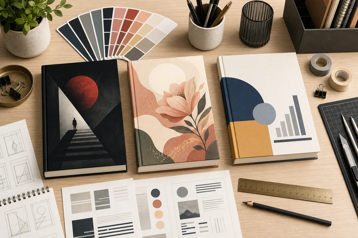
The best book cover idea is the one that sells the right promise
A cover does not need to show every scene in the manuscript. It needs one clear reader promise: genre, mood, stakes, and quality. Start with the shelf where the book should belong, then choose one visual angle that can survive a small marketplace thumbnail.
Lead with one focal point
One strong object, character silhouette, place, or symbol is easier to remember than a crowded collage.
Use genre color signals
Dark thrillers, warm romance, polished nonfiction, and bright middle grade books need different contrast and temperature.
Plan title space early
The art should leave a quiet zone for title and author text instead of forcing typography over busy detail.
Match the final format
An eBook front cover, paperback wrap, and ad thumbnail each need different crop, bleed, and readability checks.
15 book cover design ideas by genre and use case
Use the table as a starting brief. Pick the row that best matches your reader promise, then adapt colors, symbols, and typography to your exact book.
| Design angle | Visual direction | Best for | Watch out |
|---|---|---|---|
| Single symbolic object | One key object such as a key, crown, broken glass, suitcase, flower, or map placed against strong negative space. | Mystery, memoir, literary fiction, business, and books with a clear central metaphor. | Do not add too many secondary symbols. The object should carry the idea without needing a paragraph of explanation. |
| Character silhouette | A figure from behind, partial profile, or small human shape inside a larger environment. | Fantasy, thriller, romance, memoir, and journey-led nonfiction. | Avoid faces that look generic or inconsistent with the character. Silhouette is often safer than a fake portrait. |
| Landscape with title zone | A city, coast, forest, road, desert, or room composed with open space for title text. | Travel memoir, historical fiction, fantasy, suspense, and reflective nonfiction. | Beautiful scenery alone can feel like stock art. Add a genre-specific mood, object, or color story. |
| Typographic cover | Large title treatment, custom lettering, rhythm, texture, and restrained image support. | Nonfiction, essays, poetry, humor, and bold literary concepts. | Typography must still read at 120 px wide. Decorative letters should not damage the title. |
| Pattern and texture | Repeating motifs, fabric, paper grain, botanical pattern, architecture, or abstract shapes. | Cozy fiction, romance, poetry, journals, cookbooks, and elegant nonfiction. | Texture should support hierarchy. If the pattern fights the title, simplify it. |
| Genre scene thumbnail | A simplified scene that signals the shelf: candlelit room, distant castle, courtroom, lab, kitchen, or spaceship corridor. | Commercial fiction, fantasy, sci-fi, mystery, and YA books. | Do not stage an entire movie poster. A cover needs one readable beat, not a full plot summary. |
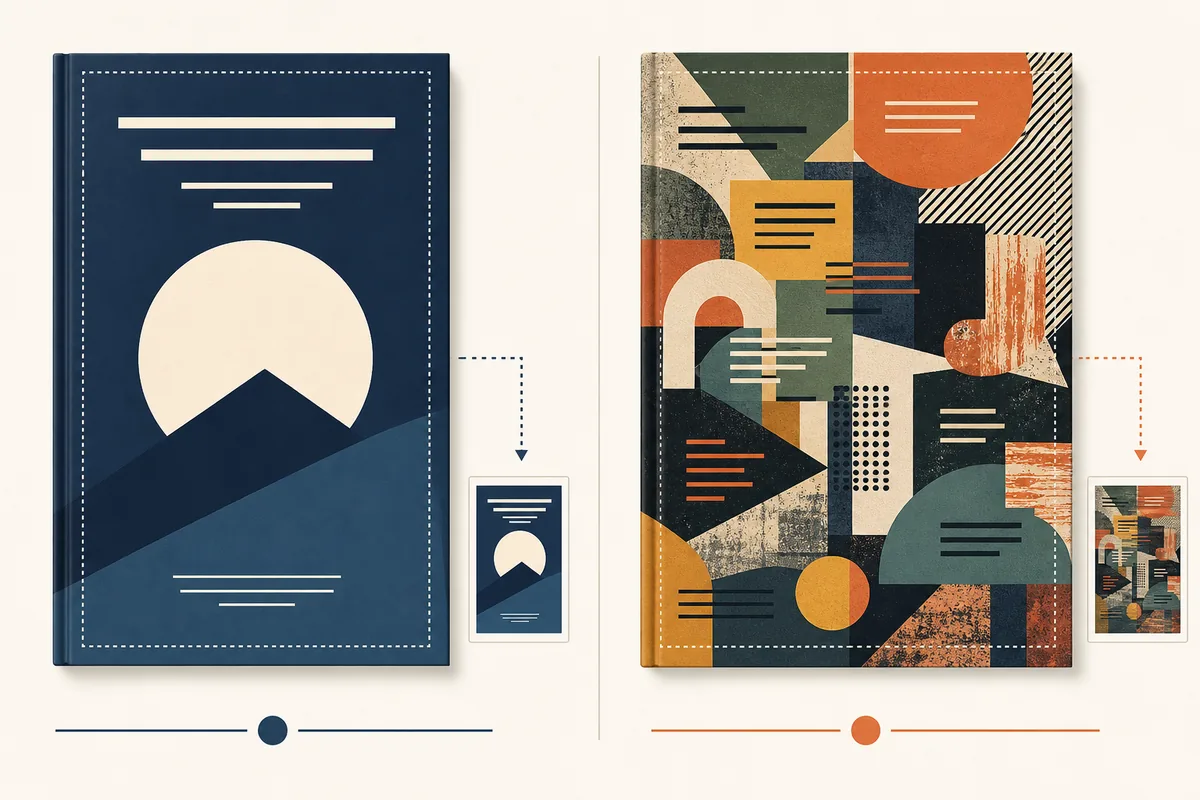
Test the idea before polishing the artwork
Many strong full-size concepts fail in search results because the title area, focal point, or contrast disappears. Run these checks before you spend time on final export.
Shrink it to listing size
Look at the cover at roughly the size used in Amazon search, newsletters, and ads. The genre and main shape should still be clear.
Squint for hierarchy
If the eye cannot find a clear first, second, and third element, reduce detail or increase contrast.
Reserve a real title zone
The title area should be intentionally quiet, not an accidental gap between busy elements.
Check the crop
A design that works as a front cover may need adjustment for square social previews, paperback wraps, and book mockups.
How to turn cover ideas into a usable design brief
The goal is not to collect hundreds of pretty covers. The goal is to choose one direction you can brief, generate, test, and publish with fewer revisions.
Define the shelf
Write the exact genre, comparable authors, reader mood, and sales channel before choosing imagery.
Choose three directions
Create one safe market direction, one mood-led direction, and one bolder concept so you can compare intentionally.
Generate textless art
Use AI or a designer to create the art without title text first. Add typography later where you control readability.
Check production needs
Use a template or size calculator when the idea moves from eBook art to paperback, hardcover, or KDP upload.
Use design ideas as prompt constraints, not decoration
A good prompt names the shelf, the focal point, the mood, the title-safe area, and the final format. That gives the generator a design job instead of a vague style request.
Example prompt structure
Textless book cover art for a psychological thriller, one lonely figure at the end of a lit apartment hallway, deep navy and warm amber contrast, strong negative space in the upper third for title, readable at thumbnail size, vertical eBook cover composition.
Useful references before final export
Style is creative, but upload rules and template dimensions still matter when the cover becomes a publishing file.
Ready to move from a cover idea to a Canva workflow?
Once the visual direction is clear, use a practical Canva process to build the title hierarchy, test the thumbnail, and prepare the right export.
책 표지 아이디어 FAQ
Turn the design idea into a publishable cover
Start with a clear direction, generate textless art, then use prompts, fonts, templates, and KDP sizing tools to finish the cover.