
Book Cover Fonts: How to Choose Readable, Genre-Right Type
The best book cover fonts do more than look stylish. They tell readers the genre, keep the title readable as a thumbnail, and leave enough hierarchy for subtitle, series name, and author name.
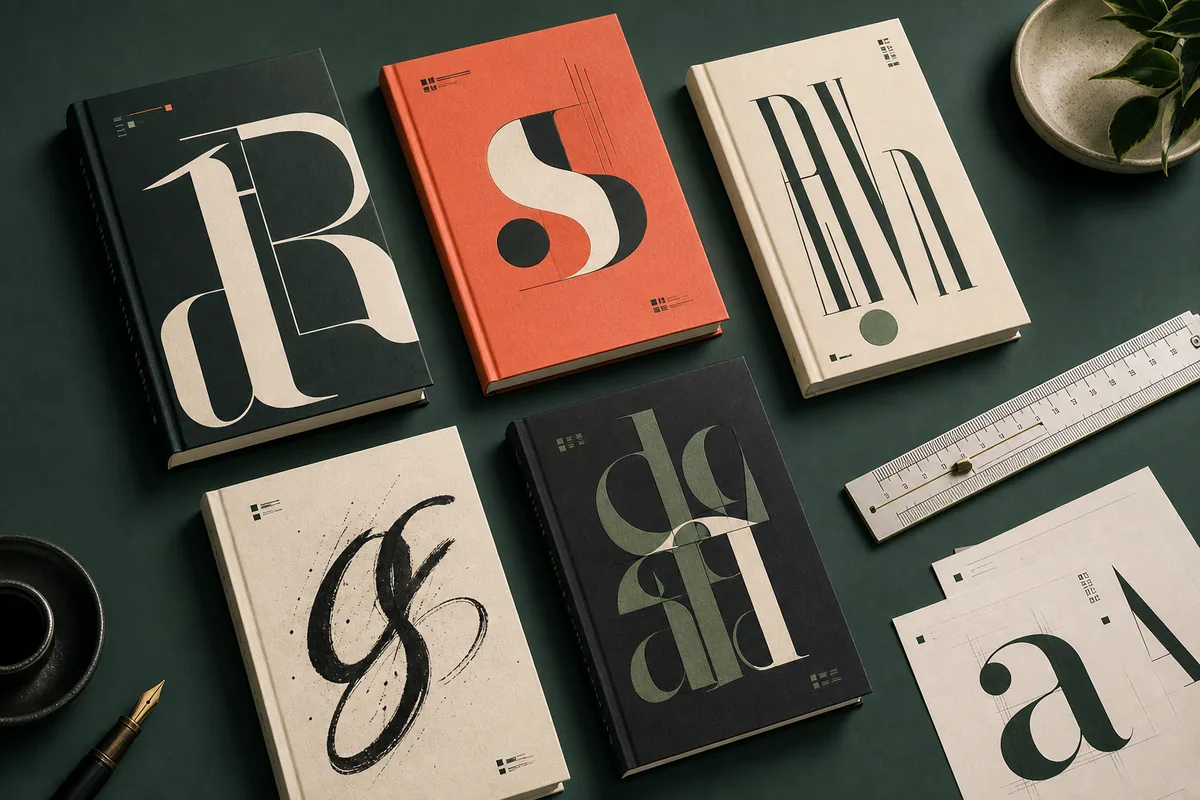
What makes a good book cover font?
Choose a title font that matches the genre, then pair it with a quieter support font. Test the cover at thumbnail size before you publish. If the title is not readable at small size, the font is not working no matter how beautiful it looks full screen.
Match the genre first
Romance, thriller, fantasy, nonfiction, and children's books all use different typography signals. Start with reader expectation before personal taste.
Design for thumbnails
Amazon, social shares, and ads often show your cover small. Use enough weight, contrast, and spacing for the title to survive.
Limit font families
Most covers need one expressive title face and one simple support face. More than two or three families usually weakens hierarchy.
Check the final file
A font choice is only finished after title, subtitle, author name, trim size, and export resolution are checked together.
Best book cover fonts by genre and use case
Use this matrix as a starting point, not a rulebook. The right font depends on your title length, cover art, marketplace category, and whether the cover must work for eBook, paperback, or series branding.
| Genre or cover type | Good title font direction | Safe pairing | Avoid |
|---|---|---|---|
| Literary fiction | Elegant serif, refined high-contrast serif, or restrained display serif. | Small caps, quiet serif, or clean sans for author name and endorsements. | Overly decorative scripts, tech fonts, or heavy effects that make the cover feel like genre fiction. |
| Thriller and mystery | Bold condensed sans, sharp slab serif, or distressed uppercase when the concept supports it. | Neutral sans for subtitle and author name, with strong spacing and high contrast. | Thin scripts, low-contrast gray type, or fonts that disappear over dark photography. |
| Fantasy | Display serif, engraved serif, or custom-feeling fantasy title face used with restraint. | Simple serif or sans for subtitle and author name so the title font can carry the atmosphere. | Using ornate fonts for every text line, which often becomes unreadable as a thumbnail. |
| Romance | Warm serif, soft script accent, or elegant hand-lettered title depending on subgenre. | Readable serif or rounded sans for author name, especially on illustrated covers. | Very thin script, crowded swashes, or low contrast over pale backgrounds. |
| Nonfiction and business | Clear sans serif, confident slab, or editorial serif with strong hierarchy. | Neutral sans for subtitle and series labels; keep the system clean and credible. | Novel-style decorative type, novelty fonts, and too many weights competing for attention. |
| Children's books | Friendly rounded display, hand-drawn style, or playful serif with large shapes. | Simple rounded sans for author name and age-range notes. | Tiny details, narrow letters, or scary genre fonts unless the book tone calls for it. |
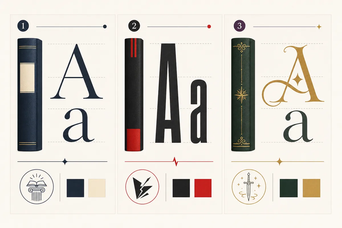
How many fonts should you use on a book cover?
For most self-published covers, two font families are enough. Use one font to create the title personality, then use a calmer font for the supporting information. The goal is clear hierarchy, not a font sampler.
Give the title the strongest voice
The title font should be the most memorable type choice on the cover. If the subtitle, tagline, and author name all compete with it, reduce their weight or switch them to a simpler family.
Pair contrast with control
A serif title can pair well with a clean sans, and a bold sans title can pair well with a quieter serif. Avoid pairing two decorative fonts because they compete for the same attention.
Use spacing as part of the font choice
Letter spacing, line height, and margins often decide whether a font works. A good typeface can still fail when the title is squeezed into the art.
Keep series branding repeatable
If you plan a series, pick a font system that can handle longer future titles, subtitles, volume numbers, and different cover art without needing a redesign.
Before publishing, test the font like a reader will see it
A font decision should be tested in real cover conditions. Zoomed-in design previews are forgiving; marketplace thumbnails are not.
Shrink to thumbnail size
Preview the cover around 120 to 180 pixels tall. The main title should still be recognizable without guessing.
Check contrast over the art
Dark type over busy dark art or pale type over glowing backgrounds often fails. Add cleaner negative space instead of relying on shadows.
Watch title length
Long titles need simpler letters and more spacing. Very decorative fonts work best for short titles or single-word emphasis.
Balance author name size
New authors usually should not let the author name overpower the title unless the name is already the main selling point.
Check mobile search results
Look at the cover on a phone. If you cannot read the title quickly, increase size, weight, or contrast.
Export and recheck
After exporting JPEG, PNG, or PDF, reopen the final file. Compression and resizing can soften thin strokes.
A simple workflow for choosing cover fonts
This process works whether you start from AI cover art, a template, or a custom designer file.
Collect genre references
Look at recent covers in your category and note whether the bestsellers use serif, sans, script, or display typography.
Set the title hierarchy
Place title, subtitle, author name, and series text before you judge the font. Hierarchy changes the font decision.
Try two controlled pairings
Compare one expressive pairing and one conservative pairing. Do not test ten unrelated fonts at once.
Use the winner in your cover tool
Once the font direction is clear, create the final cover draft in the AI book cover generator or a layout editor, then check size and export rules.
Useful references for cover typography and publishing checks
Typography taste is subjective, but file rules and marketplace readability are practical. Use official publishing references when you prepare the final cover file.
Book Cover Fonts FAQ
Turn your font decision into a cover draft
Choose a clear typography direction, then use the AI Book Cover Generator to test genre-aware cover ideas before final publishing checks.