
Fantasy Book Covers That Signal Genre Before Readers Read the Blurb
A fantasy cover has to promise the right kind of magic: epic adventure, dark folklore, romantasy, portal fantasy, or cosmic horror. Use this guide to choose visual symbols, typography, color, AI prompts, and KDP checks before you publish.
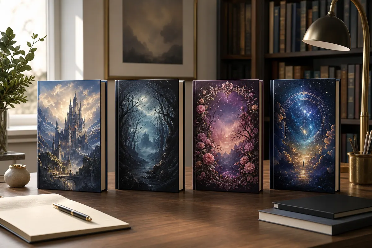
What makes a fantasy book cover look publishable?
A strong fantasy cover is not just a dramatic castle or a glowing sword. It needs an instantly readable genre signal, a clear focal point, enough empty space for title text, and a thumbnail composition that still works in Amazon, Kobo, newsletters, and ads.
Choose the subgenre first
Epic fantasy, cozy fantasy, romantasy, dark fantasy, and sword-and-sorcery use different symbols, color temperatures, and levels of drama.
Design for thumbnails
At small size, one strong silhouette beats a crowded scene with ten magical details that disappear.
Reserve title space
Fantasy covers often fail when AI artwork fills every inch and leaves no quiet area for readable typography.
Check the final format
An eBook front cover, paperback wrap, and hardcover jacket need different sizing, spine planning, bleed, and export checks.
Fantasy book cover ideas by subgenre
Use the subgenre as the design brief. A cover can be beautiful and still wrong if it promises the wrong reader experience.
| Subgenre | Visual direction | Typography signal | Avoid |
|---|---|---|---|
| Epic fantasy | Large-scale landscapes, distant kingdoms, heroic silhouettes, banners, dragons, mountains, or a journey path. | Tall serif or engraved display fonts with strong hierarchy and generous spacing. | Tiny title placement, modern sans-serif styling, or a scene that feels like generic game concept art. |
| Dark fantasy | Mist, ruined architecture, cursed forests, ravens, candlelight, bone-like shapes, and restrained contrast. | Sharper serifs, distressed texture, or gothic influence used carefully enough to stay readable. | Overloading the image with horror cliches if the story is still adventure-led. |
| Romantasy | Elegant magic, botanicals, jewels, moonlight, dramatic fabric, intimate character framing, and softer glow. | Graceful serif or light ornamentation paired with a clean author-name treatment. | Making the cover look like pure romance when court politics, danger, or magic drives the book. |
| Cozy fantasy | Warm shops, magical kitchens, gentle creatures, lanterns, maps, soft skies, and inviting color palettes. | Friendly serif or rounded display type with clear spacing and low visual aggression. | Dark battle imagery or harsh contrast that promises a much heavier reading experience. |
| Cosmic horror fantasy | Portals, impossible skies, ancient symbols, distant figures, stars, scale, and unsettling geometry. | Clean but ominous type, often with high contrast and enough negative space for mystery. | Busy monster scenes that remove the sense of scale and wonder. |
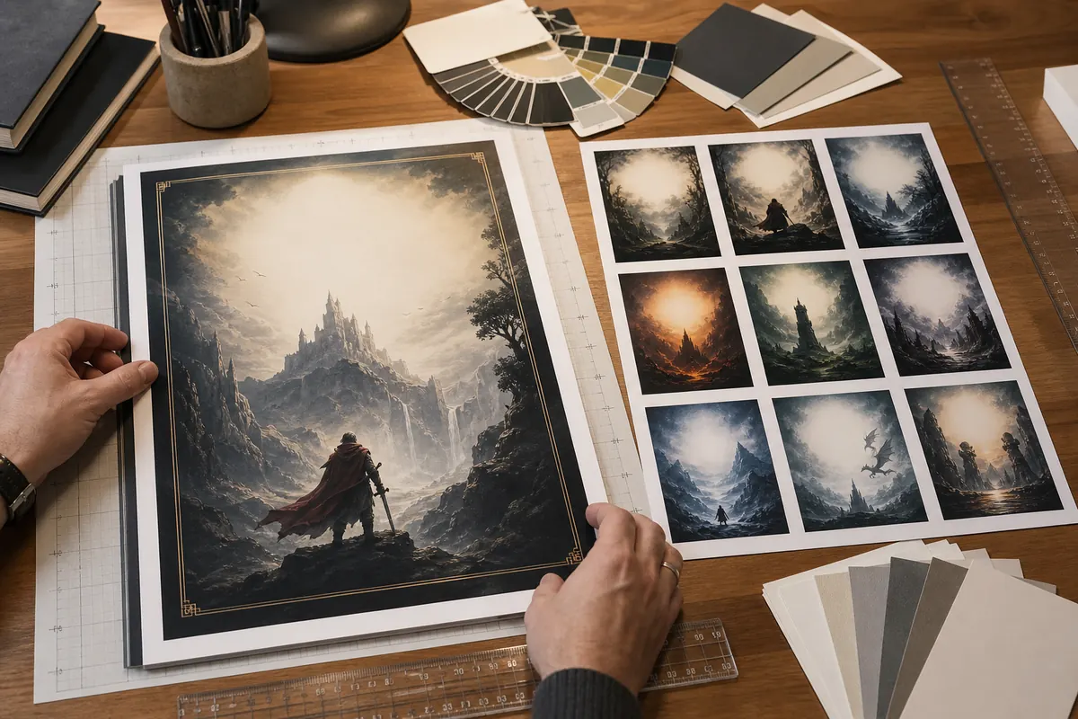
A fantasy cover has to survive the thumbnail test
Many AI fantasy images look impressive at full size but collapse in marketplace previews. Before you export, reduce the cover to the size of a search result and check whether the genre, title zone, and focal point are still obvious.
Squint at the cover
If you cannot identify the main shape with your eyes half closed, simplify the scene or increase contrast around the focal point.
Leave a real title zone
Plan one quiet area for the title and one smaller area for the author name. Do not rely on text over a busy spell effect.
Check genre from color alone
Blue-gold epic fantasy, black-green dark fantasy, blush-gold romantasy, and warm cozy palettes all set reader expectations before the title is read.
Separate eBook and print needs
A Kindle front cover can be simpler. A paperback wrap also needs back-cover copy, spine width, bleed, and barcode space.
How to brief an AI fantasy book cover generator
The best prompt gives the model the same information a cover designer would need: audience, subgenre, mood, focal subject, title-safe space, and final format.
Name the reader promise
Start with the subgenre and emotional pitch: epic quest, forbidden magic romance, cozy academy mystery, or dark folklore.
Limit the focal subject
Ask for one main subject or one strong scene. Too many characters, creatures, weapons, and symbols usually weaken the thumbnail.
Specify title-safe composition
Request clean negative space near the upper or center area, and avoid important faces or symbols where title text will sit.
Generate textless art first
AI-rendered cover text is often unreliable. Create the artwork without title text, then add typography in a controlled layout step.
Example fantasy cover prompt
Use this structure inside the Book Cover Prompts tool or adapt it for the main generator.
Epic fantasy book cover art for an adult quest novel, lone cloaked traveler on a ridge facing a luminous ancient city, blue and gold dawn light, sweeping scale, clean negative space at top for title, cinematic but not crowded, textless cover art, vertical composition.
Fantasy cover mistakes that make a good story look amateur
Most weak fantasy covers fail because the image and publishing job are fighting each other. Fix these issues before spending credits on more variations.
Too many symbols
A dragon, sword, castle, portal, moon, and five characters do not make the book feel richer. Pick the symbol that best sells the conflict.
Unreadable title treatment
Ornate fantasy fonts can work, but the title must still read at thumbnail size. Save the most decorative details for texture, not every letter.
Generic AI spectacle
Glowing particles and dramatic mist are not a concept. Add a specific setting, object, creature, or relationship that matches the book.
Wrong market signal
A cozy magical shop and a grim battlefield attract different readers. Do not mix signals unless the book truly blends those tones.
No trim or bleed plan
Artwork that only works as a front image may fail when expanded into a paperback wrap. Plan the format before final export.
Unclear rights and references
Avoid imitating living artists, famous franchises, or recognizable characters. Keep the prompt original and review the tool's commercial terms.
A practical fantasy cover workflow for indie authors
Move from concept to publishable file in stages. Each step should reduce uncertainty instead of creating more random artwork.
Collect market references
Look at current fantasy covers in your exact subcategory, not just covers you personally like.
Draft 3 clear directions
Create one safe market direction, one mood-driven direction, and one bolder concept so you can compare rather than endlessly regenerate.
Add typography deliberately
Use the book cover fonts guide to choose readable title and author-name treatment after the art direction is settled.
Prepare the publishing file
Use the KDP size calculator or template generator when you move from an eBook front cover into paperback or hardcover production.
Use official publishing checks before upload
Fantasy cover style is creative, but the final file still has to meet the platform's technical rules.
Fantasy book cover FAQ
Create a fantasy cover direction before you design the final file
Start with a clear subgenre, generate a focused cover draft, then check prompts, fonts, and KDP sizing before upload.