Romance Book Covers That Promise the Right Love Story
A romance cover should reveal the subgenre, emotional temperature, and reading experience before the blurb is opened. Use this guide to choose imagery, palette, typography, title space, and a repeatable series system without copying a passing trend.
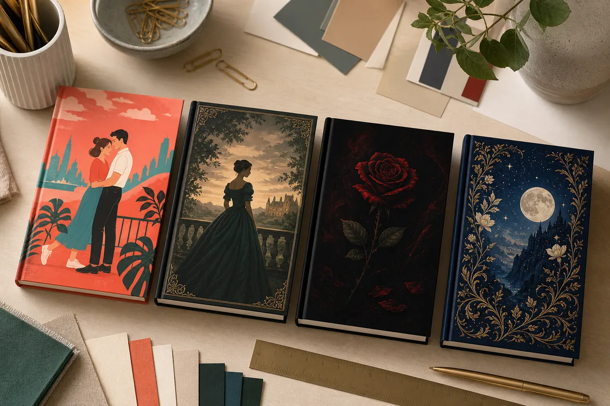
What makes a romance book cover effective?
The strongest romance covers combine a recognizable subgenre signal with one clear focal point, readable title space, and an emotional tone that matches the ending readers expect. Bright illustration can promise a witty contemporary story, while restrained photography or a symbolic object may better fit dark, historical, or high-heat romance.
Signal the subgenre
Rom-com, historical, dark romance, romantic suspense, and romantasy use different visual codes. Choose the shelf before choosing the art.
Match the heat and tone
A playful illustrated couple and a shadowed photographic figure promise very different levels of comedy, danger, and intimacy.
Protect title readability
Script can add emotion, but a full title in delicate lettering often disappears in a Kindle thumbnail. Pair personality with clarity.
Build a series system
Repeat hierarchy, type family, framing, and visual rhythm across a series while changing the focal motif or dominant color.
Romance book cover design by reader expectation
Treat these directions as a briefing map, not a paint-by-numbers formula. Study current comparable titles in your narrow category, then keep the signals readers need while giving the book one memorable detail of its own.
| Subgenre | Visual direction | Typography | Avoid |
|---|---|---|---|
| Contemporary rom-com | Bright illustration, expressive couple poses, color blocking, city or workplace props, and an upbeat focal moment. | Bold sans serif or friendly display type, with script used sparingly for warmth. | A dark photographic treatment that makes a light story look like suspense. |
| Historical romance | Period clothing, architecture, landscapes, letters, estates, or an elegant figure with era-specific detail. | Refined serif, italic contrast, and generous spacing that feels established rather than ornate for its own sake. | Modern styling, inaccurate clothing cues, or tiny decorative lettering. |
| Dark romance | Deep contrast, a single symbolic object, restrained figures, shadow, texture, and controlled red, black, or jewel tones. | High-contrast serif or strong condensed type with a clear hierarchy. | Generic skull-and-rose decoration that says nothing specific about the story. |
| Romantic suspense | Isolation, movement, weather, a dangerous location, or two figures separated by space rather than a soft embrace. | Clean, urgent lettering with less ornament and strong thumbnail contrast. | Pure thriller signals that hide the central relationship. |
| Romantasy | Botanicals, weapons, crowns, moons, magical objects, jewel tones, and an intimate sense of danger or wonder. | Elegant serif with restrained flourishes and enough quiet space to stay readable. | Reusing a generic fantasy layout that never communicates romance. |
| Sweet or small-town romance | Warm places, seasonal details, homes, shops, community symbols, gentle character moments, and inviting palettes. | Friendly serif or rounded display type with clear, approachable spacing. | Overstating sensuality or menace when comfort is the main promise. |
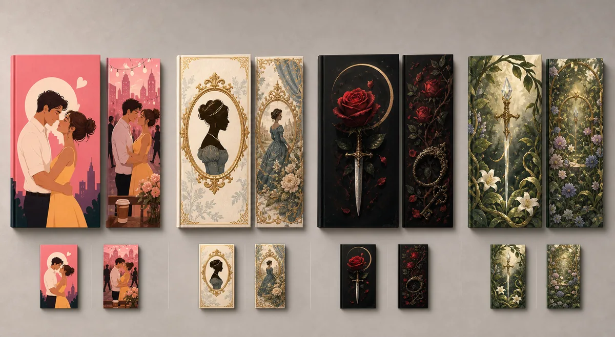
Romance covers must still communicate at marketplace size
Most shoppers first see a cover as a small image beside several competing books. Reduce the draft to roughly 120 pixels wide. The emotional tone, focal subject, and title hierarchy should remain recognizable without zooming.
Identify the promise in one second
Ask an unbiased reader what genre, tone, and relationship energy they expect. If the answer is wrong, fix the visual signal before polishing details.
Check title and author hierarchy
The title should be the first readable text unless the author name intentionally leads an established brand. Avoid making every line equally loud.
Remove details that vanish
Tiny flowers, background characters, and delicate borders may add cost without adding meaning. Keep only details that support the focal idea.
Test grayscale and low brightness
A quick grayscale or dim-screen check reveals whether the cover depends on color alone and whether the title separates from the artwork.
Turn the manuscript into a focused romance cover brief
A useful brief gives a designer or image generator constraints that can be evaluated. It does not retell the plot or ask for every trope to appear on the front.
Name the precise market
Write the subgenre, audience, heat level, emotional tone, sales format, and three current comparable books whose readers you genuinely share.
Choose one visual promise
Select a relationship moment, setting, character silhouette, or symbolic object that communicates the core emotional experience without explaining the whole story.
Reserve a title-safe zone
Decide where the title and author name belong before generating art. Keep faces, hands, symbols, and strong contrast away from that area.
Create three controlled directions
Compare a market-safe concept, a mood-led concept, and a bolder symbolic concept. Change one major variable at a time so feedback remains useful.
Prepare the publishing file
An eBook needs a strong front cover; a paperback also needs the spine, back cover, bleed, barcode space, and dimensions based on trim, paper, and page count.
Why romance book covers miss their intended readers
A polished image can still fail when it promises the wrong subgenre or cannot support usable typography. Review these problems before paying for more variations.
Following a trend without checking fit
Cartoon couples, sprayed edges, floral weapons, and object-led dark covers are choices, not universal answers. Use the convention only when it matches the story and category.
Mixing incompatible signals
A cheerful palette, gothic title, erotic pose, and cozy setting may create confusion instead of range. Establish one dominant promise and let secondary cues support it.
Using script for every word
Decorative scripts can add romance but often lose legibility in long titles, subtitles, and author names. Pair them with a clean supporting face.
Showing generic attraction
A stock embrace may say romance but not why this romance matters. A location, occupation, era, object, or relationship dynamic can create a more distinctive signal.
Ignoring series continuity
When each installment uses unrelated type, framing, and color logic, readers cannot recognize the set. Define repeatable rules before book one is final.
Treating front art as a print wrap
A good eBook cover is not automatically a valid paperback file. Calculate the full wrap after the final page count and keep important elements inside safe zones.
Check design inspiration and publishing requirements separately
Use genre examples to understand reader expectations, then verify dimensions and file rules with the publishing platform before export.
Romance book cover FAQ
Turn your romance brief into a focused cover direction
Define the subgenre and emotional promise, generate text-safe art, then verify fonts and KDP dimensions before publishing.