Book Back Cover Design That Makes the Story Easier to Choose
A strong book back cover does more than fill the reverse side. It gives the right reader a clear promise, supports the front-cover mood, leaves room for practical publishing elements, and turns curiosity into a confident next step.
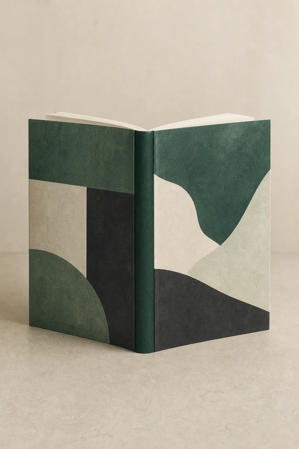
What should a book back cover do?
Use the back cover to answer the reader's quiet questions: What kind of story is this, why should I care, and what experience will I get if I open it? Keep the copy specific, the hierarchy calm, and the production space intentional.
Clarify the promise
Lead with the story's hook, genre signal, or reader benefit instead of repeating the front-cover title. The back should reduce uncertainty quickly.
Build a readable blurb
A short hook, rising pressure, and unanswered question usually work better than a full plot summary. Stop before the resolution.
Connect the full wrap
Color, texture, and visual rhythm should continue across the front, spine, and back. A beautiful panel can still fail as a wrap.
Protect production space
Leave room for safe margins, barcode treatment, author information, and the final template. Print files need more planning than an eBook front cover.
Give every area one clear job
A back cover becomes easier to design when you separate editorial work from production work. First decide what the reader needs to understand; then reserve enough space for the spine, bleed, safe zone, and barcode treatment required by the final format.
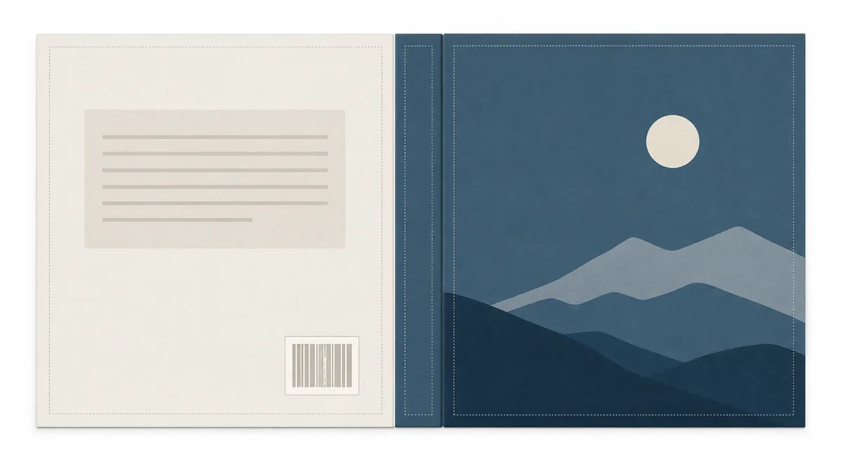
| Area | Main job | What to include | What to avoid |
|---|---|---|---|
| Blurb area | Make the story promise concrete | A hook, protagonist or problem, escalating stakes, and one unanswered question. | A chapter-by-chapter summary, a vague mood paragraph, or a spoiler-heavy ending. |
| Genre signal | Confirm the shelf and reader expectation | The same color language, imagery, and tone that the front cover establishes. | A visual style that suggests a different genre or audience from the front. |
| Author note | Add a small layer of trust when useful | A concise bio, series note, review excerpt, or author photo only when it supports the sale. | A long biography that pushes the actual book promise below the fold. |
| Barcode zone | Keep a scannable area available for the print edition | A quiet, high-contrast area that follows the chosen retailer or printer template. | Important artwork, tiny type, or critical copy underneath the final barcode placement. |
| Spine transition | Make the wrap look intentional on a shelf | A controlled color or texture transition and a title treatment that remains legible at the spine width. | Faces, thin lines, or essential text crossing a trim or fold without checking the template. |
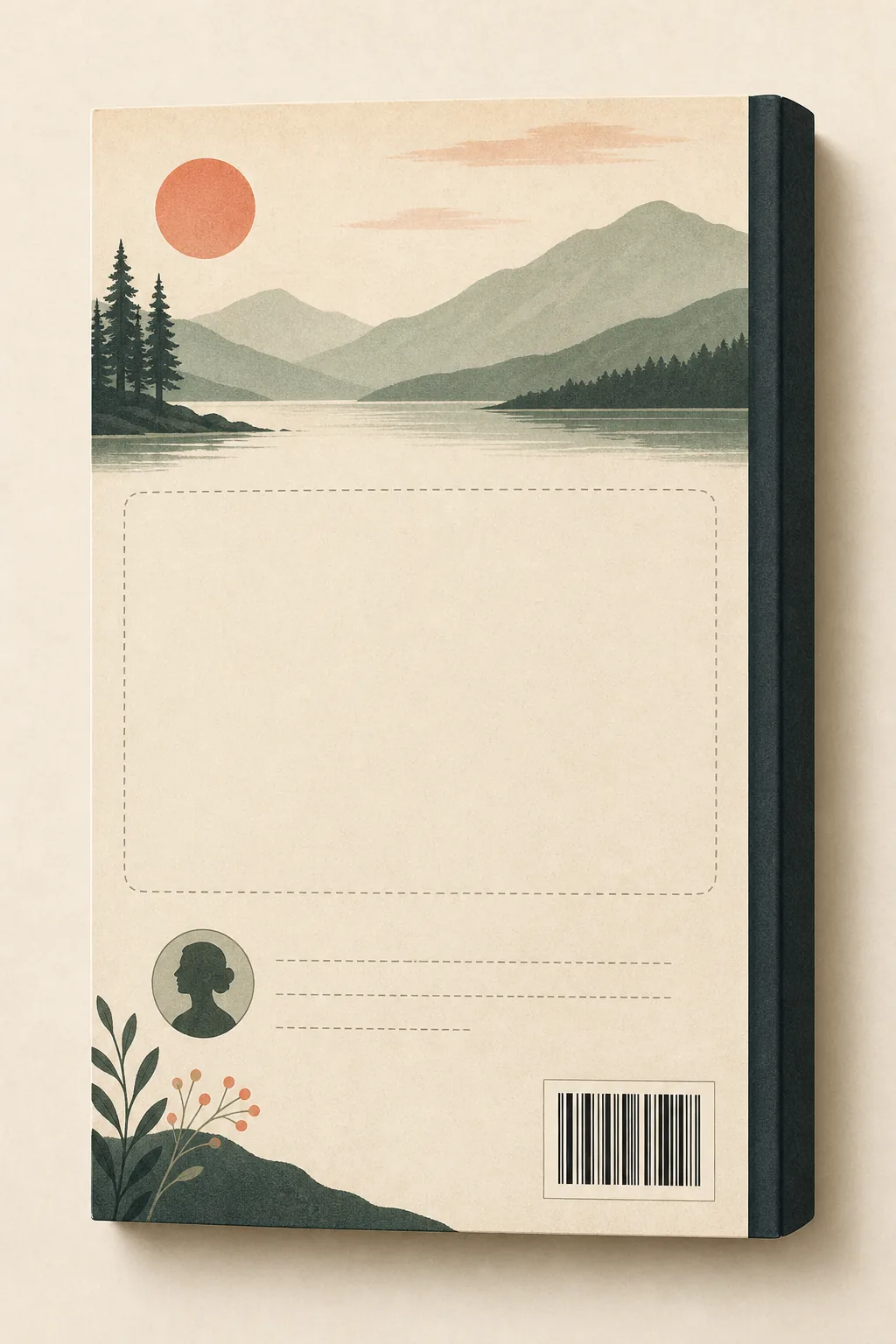
Write the copy before you decorate the panel
The most useful back cover design often starts as an editing problem. Write the reader promise first, then shape the empty space, type scale, and supporting image around the words that need to be read.
Start with the shelf
Name the genre, subgenre, comparable reading experience, and intended audience. A romance blurb, a thriller blurb, and a nonfiction promise need different pacing.
Open with a specific hook
Introduce the person, situation, question, or transformation that makes the book distinct. Concrete details create a stronger invitation than broad praise.
Raise pressure without resolving it
Show what can be lost, what choice is coming, or what problem keeps moving. End with curiosity rather than explaining the final outcome.
Edit for the actual panel
Read the copy at the size a shopper will see. Remove repeated adjectives, long setup sentences, and anything that forces the type below a comfortable reading size.
Add proof only when it helps
A short review line, series promise, author note, or credential can support the decision, but it should not compete with the story hook or main benefit.
A back cover is not the same as an eBook front cover
The right layout depends on where the cover will be used. A digital front cover can focus on one vertical image; a paperback or hardcover wrap must coordinate the back, spine, front, bleed, trim, and safe areas in one file.
Paperback and hardcover
Plan the complete wrap and confirm the spine width after trim size, paper type, and page count are settled. Use a production template for the final measurements.
eBook front cover
An eBook usually needs a front cover image rather than a print back panel. Do not force a barcode, blurb, or spine treatment into a small digital thumbnail.
Series consistency
Keep recurring genre cues, author placement, and back-panel rhythm consistent across a series while allowing each book's hook to remain specific.
Template handoff
When the design moves to print, compare your artboard against the official or printer-provided template instead of estimating the spine and barcode position by eye.
What makes a back cover feel unfinished?
Most weak back covers are not missing decoration. They are missing a clear priority. Fix the message and the panel usually becomes easier to finish.
Repeating the front cover
The back should add a reason to keep reading, not use the same title, image, and slogan again with less space.
Writing a synopsis instead of a pitch
A complete summary explains the book but can remove curiosity. Give enough context for a decision and keep the unresolved tension visible.
Treating the barcode as an afterthought
A last-minute barcode can cover the strongest visual or force a rushed crop. Reserve the zone early and confirm the final template.
Using tiny or low-contrast type
The back cover is still a reading surface. Test it at a realistic thumbnail and print-preview scale before adding more copy.
Mixing genre signals
A front cover that promises a cozy mystery should not turn into a high-drama action poster on the back. Keep the reader expectation coherent.
Leaving no revision margin
Keep editable text and image layers separate until the blurb, review line, and print measurements are final. Flattening too early slows every correction.
Review the back cover before export
Use this short pass after the writing and visual direction are both stable. If the answer is no, fix the source file before polishing effects or exporting a print-ready PDF.
The first sentence earns attention
The opening hook is specific enough to distinguish the book without depending on the front-cover title.
The genre is obvious in seconds
Words, color, image treatment, and type choices point toward the same reader expectation.
The blurb is readable at the intended size
Line length, contrast, spacing, and type size remain comfortable in a print preview and a small online preview.
The spine and barcode have safe space
The complete wrap follows the selected template, with important text away from trim, folds, bleed, and barcode placement.
The author or review line is optional, not dominant
Secondary proof supports the decision and can be removed without breaking the main composition.
The final file matches the format
You have confirmed whether the deliverable is an eBook front cover, paperback wrap, hardcover wrap, or another printer-specific file.
Book Back Cover Design FAQ
Check the production rules before final export
Editorial choices are yours, but print dimensions, bleed, spine calculations, and barcode placement should follow the current requirements for the format and service you are using.
Turn the back-cover plan into a usable draft
Start with the reader promise, protect the production zones, and use the existing generator or template tools when you are ready to build the wrap.