
Book Cover Design Checklist: A Pre-Publish Guide
Use this book cover design checklist when a concept is close to finished and you need a calm, repeatable review. It covers the reader promise, typography, image rights, thumbnail behavior, print safety, export settings, and the handoff package.

What should a book cover design checklist verify?
A useful book cover design checklist verifies two things at once: whether the cover makes the right promise to the intended reader, and whether the final file can be uploaded or printed without avoidable errors. Start with the title, author name, genre, and audience. Then inspect the image, hierarchy, contrast, crop, and small-size view before you spend time on production details.
For a print edition, the review must expand beyond the front cover. Confirm the single spread, trim size, bleed, safe area, spine width, barcode zone, color mode, PDF settings, and page-count assumptions. For an eBook, focus on a clean front image, legible type, correct pixel dimensions, and a thumbnail test. The creative direction can be shared across formats, but the approval files should be separate.
Use the list below as a stop-and-fix workflow. If an item cannot be proven with the brief, a preview, a template, or the handoff folder, mark it open instead of guessing. That small habit prevents expensive revisions after a proof or retailer upload.
The checklist is a review aid, not a substitute for the current requirements of your distributor or printer. Always compare the final file with the official template for the exact format, trim, paper, and page count.
Eight checks before you approve a cover
Move from reader-facing decisions to file-facing decisions. A cover that passes every row has a clear promise, a controlled layout, and evidence that the production file is ready for its destination.
| Area | What to check | Evidence | Next action |
|---|---|---|---|
| Brief and audience | The title, subtitle, author name, series label, format, retailer, and primary audience are written in one short brief. The brief says what a reader should feel or expect in three seconds. | A current cover brief or project note that names the dominant genre and the sale channel. | Resolve missing copy or audience details before polishing artwork. |
| Genre promise | The visual language belongs on the intended shelf. Color, subject, pace, typography, and mood attract the right readers instead of borrowing a look from a neighboring genre. | A small comparison set of recent covers in the same subgenre, plus one sentence explaining the difference. | Simplify or reposition the concept if test readers name the wrong genre. |
| Title and author | The title is the first readable element, the author name has a deliberate level of prominence, and subtitle or series text is still legible without competing with the title. | A flattened front-cover preview and a text-only proof at the target thumbnail size. | Change hierarchy, spacing, or line breaks before changing decorative detail. |
| Image and rights | The main image has enough resolution for the format, the crop is intentional, and every photo, font, texture, or generated element has a documented use right for the planned markets. | Asset folder, license receipts or terms, source links, and a note about any AI-assisted artwork. | Replace uncertain assets or record the license scope before delivery. |
| Typography | Letterforms, contrast, tracking, and line length work against the artwork. The type remains recognizable when the cover is viewed in grayscale or on a low-brightness screen. | A full-size proof, a grayscale proof, and a mobile-sized preview. | Increase contrast or remove a type style that only works at full size. |
| Thumbnail | At marketplace or ad thumbnail size, the title, author signal, focal image, and genre cue survive. No important face, object, or word sits on a crop edge. | A 120 to 200 pixel preview beside two or three comparable listing covers. | Recompose the focal point or shorten the title treatment if the promise disappears. |
| Print file | A print wrap has the correct back, spine, front, bleed, safe area, barcode zone, trim, color profile, and page-count assumptions. The spine text is not placed on a guessed width. | The current printer or KDP template with the cover placed on one spread and checked in a preflight view. | Recalculate the spine or download a new template when any production input changes. |
| Handoff package | The final folder identifies approved files, source files, fonts, licenses, version date, contact person, and the exact change still allowed after approval. | A named archive or shared folder that another person can open without asking where the final file is. | Freeze the approved version and record a single owner for later edits. |
Do not mark a row complete because the cover looks polished. Mark it complete when the related evidence exists and matches the edition you are about to publish.
Check the promise before the pixels
A preflight review starts with the reader's decision, not with a favorite effect. These checks help an author decide whether the cover is communicating the right book before production work makes change expensive.
Name the dominant genre
Write the shelf or store category a stranger should identify first. A cross-genre book can have secondary flavor, but the cover still needs one dominant signal. If three reviewers name three unrelated shelves, revise the concept before refining it.
Make the promise specific
A cover does not need to summarize the plot. It should signal the kind of experience: comfort, danger, discovery, expertise, transformation, or mystery. Choose one visual promise and remove details that compete with it.
Protect the title zone
Reserve quiet space for the title and author name before adding texture or background detail. A busy image can be beautiful at full size and still force unreadable type when the listing card becomes small.
Use comparable covers fairly
Compare against current books in the same market and format, not against a random moodboard. Look for the shared conventions that help a reader identify the shelf, then choose one controlled difference that gives the cover a reason to be remembered.
Test a cold reaction
Show a small preview without explaining the manuscript. Ask what genre, audience, and mood the person expects. This is not a popularity vote; it is a quick test of whether the intended signal arrives without the author's private context.
Separate taste from fit
A designer or author can dislike a color while the target shelf uses it effectively. Record whether feedback concerns personal taste, legibility, market fit, accuracy, or production risk, then fix the category that actually blocks the release.
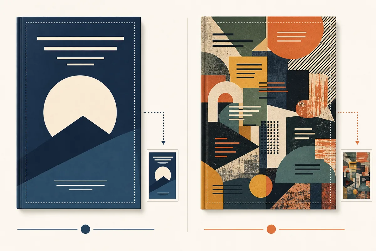
Review the cover at the size readers actually see
Many readers first meet a cover in a store grid, an ad, a newsletter, or a phone screen. A thumbnail test is a fast way to find weak hierarchy. It should be a separate proof, not a cropped screenshot that hides the real edges.
- 1Shrink the front cover to the approximate size used by the retailer or ad placement, then view it at normal screen brightness.
- 2Read the title aloud from the small preview. If you need to zoom, the type hierarchy needs another pass.
- 3Hide the title briefly and ask whether the image still suggests the intended genre rather than a generic stock scene.
- 4Check the crop at the top, bottom, and sides. Faces, hands, symbols, and the first letter of the title should not be clipped.
- 5Compare the cover beside three current category listings. Look for a clear shelf signal and a controlled point of difference.
- 6Repeat the check in grayscale and on a narrow phone viewport so contrast problems are not masked by a large bright monitor.
- 7Save the thumbnail proof with the date and edition name. It becomes useful evidence when a later resize changes the crop.
Confirm the production file, not only the front image
A print-ready cover is a measured spread. A digital cover is a front image with its own pixel and readability requirements. Keep the two decisions connected to the same brief, but inspect each file on its own terms.
Start from the current template
Use the distributor or printer template for the exact trim size, binding, paper, ink, and page count. A remembered size or an old template can move the spine and barcode even when the artwork has not changed.
Treat the spread as one file
For a paperback or hardcover wrap, inspect back cover, spine, front cover, bleed, trim, and safe areas together. Keep background art extending through bleed while keeping important text away from folds and cuts.
Check spine and barcode zones
Spine width depends on the final page count and paper choice. Confirm spine text direction and alignment, leave the barcode area clear, and verify that any price or ISBN information belongs to this edition.
Confirm color and export
Review the required color profile, resolution, transparency behavior, PDF preset, image compression, and font handling. Open the exported file on another device instead of trusting the design application's canvas.
Keep eBook and print exports separate
An eBook front cover does not need a spine or back cover, while a paperback upload usually does. Shared art direction is useful, but naming and approving separate exports prevents the wrong file reaching the wrong channel.
Use the upload preview as evidence
Where the retailer or printer provides a preview, check it after export. Look for unexpected crop, thin type, missing bleed, barcode overlap, color shifts, or a page-count mismatch before placing the order.
A current template beats a confident guess
If trim size, page count, paper, binding, or barcode details change, treat the cover as a new production check. Reopen the official template and recalculate rather than adjusting the old spread by eye.
Run the checklist in five calm passes
Short passes reduce context switching. Keep the creative review, thumbnail test, production check, and handoff review separate so a late technical fix does not quietly undo a reader-facing decision.
Freeze the brief
Write the final title, author name, genre, format, market, and intended reader in the review note. Record which file is the candidate for approval.
Review the promise
Check genre, mood, focal point, title hierarchy, and audience reaction at full size and at a small preview. Fix meaning before decoration.
Run production preflight
Place the art on the current template and inspect trim, bleed, safe area, spine, barcode, color, resolution, and export settings.
Ask for one focused review
Give the reviewer a short brief and ask for observations by category: message, readability, market fit, or production risk. Do not collect unstructured taste edits.
Archive the decision
Name the approved file, preserve sources and licenses, write the date, and note who may make later changes. Then upload the exact approved export.
Make the final folder understandable to someone else
A handoff is part of the book cover design checklist because production rarely ends with the first export. A publisher may need a translated title, a new price, a paperback edition, an audiobook square, or a series update months later. If the approved file cannot be identified quickly, a small change can become a full redesign.
Include one clearly named final export and keep working files in a separate source folder. Add the cover brief, the current template, image and font licenses, credit notes, and a short change log. If an asset was generated or edited with AI, describe the workflow and the human review that was applied rather than assuming the future editor will remember it.
The handoff should also state what is not included. For example, a quote may cover an eBook front but not a paperback wrap, or a first edition but not later translations. Clear boundaries protect the author, designer, and printer from treating an old file as a new approval.
A practical handoff folder
- 01-final-ebook-front.jpg or the exact digital format requested by the retailer.
- 02-final-print-wrap.pdf with trim, bleed, spine, and barcode checked on the current template.
- source/ with the editable layout and linked assets, clearly marked as working files.
- licenses/ with receipts, URLs, usage terms, and the market or edition they cover.
- brief/ with final title, author name, subtitle, genre, format, and approval notes.
- proofs/ with the full-size, grayscale, and thumbnail reviews used for sign-off.
- change-log.txt with the approval date, version name, and the person allowed to edit it.
- A note about any excluded resize, translation, audiobook, advertising, or series work.
Six problems a final review often catches
These mistakes are common because the cover can look finished while the evidence behind it is incomplete. Use them as prompts for a slower second look.
The cover signals the wrong shelf
A beautiful image can still attract the wrong audience. Return to the dominant genre and compare the small preview with current category covers.
The title works only at full size
Thin strokes, low contrast, long lines, or decorative scripts disappear in a store grid. Fix hierarchy before adding more effects.
The spine was guessed
A page-count or paper change makes an old spine width unreliable. Use the current official calculator or template and recheck the text.
The barcode or safe area is crowded
Important copy near the trim, fold, or barcode zone may be clipped or covered. Keep the spread visible while checking each production boundary.
A license is assumed, not documented
Stock, fonts, textures, and generated elements need a record of permitted use. Save the terms with the edition rather than relying on memory.
The wrong export reaches the channel
Separate filenames and folders for eBook, paperback, hardcover, and promotion make it harder to upload a front-only image where a wrap is required.
Use current production guidance for the last check
The checklist combines editorial review with production checks. Official distributor or printer instructions remain the final authority for an upload.
Book Cover Design Checklist FAQ
Finish the checklist, then create with confidence
Use the review to identify the one missing decision. When the brief is ready, explore a cover direction or calculate the exact print file.