
Book Cover Typography: Build a Clear Title Hierarchy
Book cover typography is the system that makes a cover readable before a reader notices the artwork. Set the title, author name, subtitle, and series text in a deliberate order, then test the result at the size readers will actually see.

What should book cover typography do first?
Start with a reading order: title, genre signal or subtitle, then author name and series information. Choose fonts after the hierarchy is clear. A beautiful typeface cannot rescue a cover where every line has the same size, weight, or contrast.
Set one clear first read
A reader should identify the book title in a glance. Give it the strongest scale, contrast, or position on the front cover.
Build a small type system
Use a controlled relationship between title, author, subtitle, series label, and small supporting details instead of styling each line alone.
Design for the thumbnail
Marketplace cards and social posts shrink the cover. Check letter shapes, line breaks, and contrast before polishing fine detail.
Use space as a tool
Tracking, line height, margins, and a quiet title zone often improve readability more than adding an outline or shadow.
Book Cover Typography Hierarchy by Text Role
Treat every text element as a job with a different level of attention. The exact sizes depend on the format and title length, but the relationships below give you a reliable starting point for an eBook front or a print front panel.
| Text role | Job on the cover | Relative emphasis | Check before export |
|---|---|---|---|
| Book title | Name the book and create the first visual promise. | Strongest scale or contrast; keep the line breaks intentional. | Can a new reader read it in one second at thumbnail size? |
| Subtitle or promise | Clarify the hook, category, or practical benefit when the title needs context. | Noticeable but clearly quieter than the title. | Does it support the title without becoming a second headline? |
| Author name | Provide recognition and a stable series signature. | Consistent across a series; usually below title priority for a new author. | Is the name legible without competing with the title? |
| Series label | Tell readers that this book belongs to a repeatable set. | Small, consistent, and placed in the same zone on every book. | Does it stay away from trim, spine folds, and busy artwork? |
| Badge or endorsement | Add a short signal such as an award, edition, or reader promise. | Use sparingly; a badge should never steal the title's first read. | Can it be removed without breaking the composition? |
| Back-cover copy | Explain the promise after the front cover earns attention. | Readable body text with comfortable line length and contrast. | Does the full wrap leave a barcode and safe area clear? |
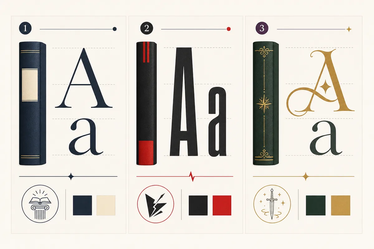
Pair type, spacing, and contrast as one decision
A font choice is only one part of book cover typography. Start with the role of each line, then adjust weight, width, tracking, and contrast together. The safest system usually has one expressive title voice and one quieter support voice. Link to the book cover fonts guide when you need a genre-specific typeface shortlist.
Choose the title shape before the font name
Test the real title, including its longest word and likely line break. A font that looks good in a specimen can fail when the title becomes a tall stack or a wide single line.
Create contrast with a reason
Pair a strong display face with a calm support face, or contrast weight and width within one family. Two decorative faces usually compete instead of creating hierarchy.
Let negative space carry the message
Reserve a quiet area for type before you generate or crop the art. Extra shadows and outlines can make letters muddy when the background is already busy.
Keep the system repeatable
A series needs rules that survive longer titles, different art, and small format changes. Record the title scale, author zone, tracking range, and minimum contrast for the next book.
Test book cover typography at the reader's real size
Full-screen previews hide problems. Use a quick preflight before you export: shrink the cover, view it on a phone, and remove detail that competes with the first read.
Shrink to listing size
Preview the front around 120 to 180 pixels tall. The title should remain recognizable without zooming or guessing.
Inspect line breaks
Break long titles at natural phrases. Avoid a lonely short word on a final line unless the shape is intentional.
Check contrast over art
Dark letters on dark art and pale letters over bright detail both disappear. Move the title into negative space before adding effects.
Check margins and safe zones
Keep important letters away from crop, trim, spine folds, and the edge of a social preview. Production space is part of the design.
Review on a phone
A quick mobile check reveals thin strokes, cramped tracking, and an author name that becomes impossible to read in a store grid.
Reopen the exported file
JPEG compression, resizing, or PDF conversion can soften thin type. Inspect the final file, not only the editable draft.
A five-step book cover typography workflow
Use this sequence for an AI-generated concept, a Canva file, or a designer handoff. It keeps content decisions ahead of decoration.
Name the shelf
Write the exact genre, subgenre, audience, and sales channel. The expected shelf language should influence type mood and emphasis.
Place every text role
Add title, subtitle, author name, series label, and any badge before choosing a typeface. This exposes collisions early.
Test two controlled systems
Compare one expressive option with one restrained option. Change one variable at a time so you know what improved the cover.
Run the thumbnail preflight
Check small size, mobile view, contrast, line breaks, and safe areas. If the first read fails, simplify before adding effects.
Hand off production checks
Use the KDP calculator or official template for final dimensions, bleed, spine width, and barcode space after the type system is stable.
Fix the typography mistake before it becomes a cover problem
Most type failures are visible early. Use the cause and fix columns as a short review with a co-author or designer.
| Mistake | Why it fails | Practical fix |
|---|---|---|
| Every line is bold and large | Nothing tells the eye where to start, so the cover feels loud and slow to read. | Give the title the strongest role and reduce support text by scale, weight, or contrast. |
| The art decides the title zone | Important letters land on faces, texture, or a fold and become hard to scan. | Reserve negative space before final art, then move or crop the background to protect it. |
| Effects replace contrast | Heavy glow, stroke, and shadow create muddy edges at thumbnail size. | Use cleaner contrast and a calmer background before adding a restrained effect. |
| A series changes its rules | Readers cannot recognize the books as a set when the title and author zones move every time. | Document repeatable zones, scale relationships, and a small approved type palette. |
| The draft is never tested after export | Resizing and compression can erase thin strokes that looked fine in the editor. | Inspect the exported JPEG, PNG, or PDF on a phone and at listing size. |
Useful references for the final typography handoff
Type decisions are creative, but final files still need production checks. Use first-party publishing guidance for the current upload requirements.
Book Cover Typography FAQ
Turn a clear type system into a cover draft
Set the title hierarchy first, then use an AI cover workflow to explore art that protects your readable text zones.