Horror Book Covers That Create Dread Before the First Page
The best horror book covers do not simply look dark. They promise a specific kind of fear—gothic decay, psychological unease, folk ritual, body horror, slasher tension, or cosmic insignificance—while keeping the title readable at store-thumbnail size. This guide turns that promise into a practical design brief.
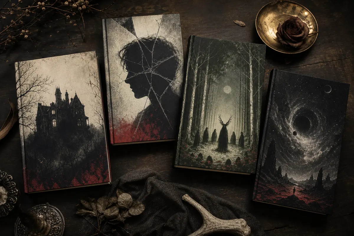
What makes a horror book cover effective?
An effective horror cover creates one precise question in the reader's mind: what is behind the door, why is the figure alone, what happened in the woods, or what is watching from the dark? Use one focal symbol, enough contrast for a thumbnail, typography that belongs to the subgenre, and restraint. Suggesting danger is usually more memorable than showing every threat.
Name the fear
Choose the emotional promise first: dread, disgust, isolation, pursuit, paranoia, grief, or forbidden curiosity. Each leads to a different visual direction.
Use one focal mystery
A doorway, moth, silhouette, house, mask, tree, or impossible shape can carry the cover. Too many symbols turn tension into visual noise.
Protect title readability
Reserve a quiet title zone before generating artwork. Horror fonts can feel distressed or gothic without becoming difficult to read.
Test the thumbnail
Reduce the cover to a small marketplace preview. The central shape, title hierarchy, and tonal contrast should remain clear.
Horror book cover ideas by type of fear
Readers use cover signals to decide whether a book offers haunted-house atmosphere, intimate psychological tension, ritualistic folk dread, visceral transformation, or unknowable cosmic scale. Match the visual language to the actual reading experience.
| Horror subgenre | Visual direction | Typography signal | Avoid |
|---|---|---|---|
| Gothic horror | Decaying houses, long corridors, dead gardens, candlelight, family portraits, lace, fog, and architectural shadows. | High-contrast serif, restrained ornament, or an elegant title interrupted by one unsettling detail. | Generic blood effects or modern slasher cues when the story depends on atmosphere, history, and repression. |
| Psychological horror | Fragmented portraits, negative space, mirrors, domestic objects, repeating forms, surveillance angles, and ambiguous shadows. | Clean or slightly disrupted type with controlled spacing; let one distortion imply instability. | Explaining the monster visually. Ambiguity should support the character's unreliable perception. |
| Folk horror | Forests, fields, handmade masks, antlers, woven symbols, firelight, rural architecture, and small human figures. | Weathered serif or handmade influence used sparingly, supported by earthy colors and tactile texture. | Random occult symbols that do not connect to the culture, setting, or ritual in the story. |
| Body horror | Organic pattern, transformation, abnormal symmetry, medical texture, skin-like surfaces, or a familiar object becoming wrong. | Simple, clinical, or compressed type that contrasts with the organic image. | Graphic gore as the only idea. Suggest transformation and loss of control without making the cover unreadable or exploitative. |
| Cosmic horror | Tiny figures, impossible geometry, deep space, vast structures, eclipses, voids, and landscapes with unnatural scale. | Minimal, spacious type that preserves scale and mystery rather than competing with the image. | A detailed creature portrait that makes the unknowable threat feel small and ordinary. |
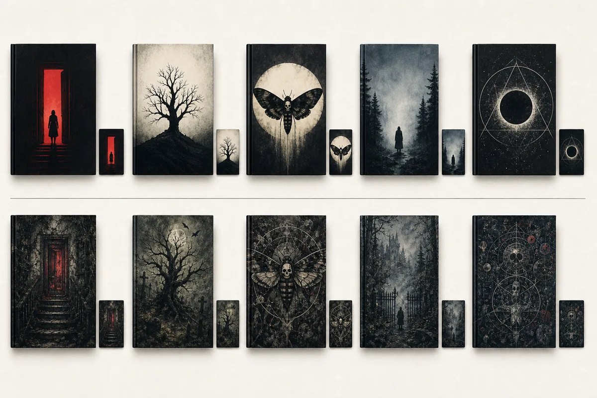
Fear must survive the thumbnail test
Horror artwork often depends on subtle shadows and texture, but online stores compress the cover into a small rectangle. Test the design before final typography so darkness does not swallow the focal point and distressed lettering does not dissolve.
Find the shape in one second
If the doorway, figure, tree, house, or symbol disappears at small size, simplify the composition or separate it from the background.
Lift important blacks
Pure black can erase useful detail on dim screens. Keep enough tonal separation around the focal subject and title zone.
Limit distressed type
Use texture as an accent, not as damage to every letter. The title should still read in a search result or social card.
Compare against the real shelf
Place the draft beside current covers from the same horror subgenre. It should belong to the category without looking like an imitation.
How to prompt an AI horror book cover generator
A useful prompt describes the reader promise, focal subject, setting, composition, palette, title-safe space, and what to exclude. It should direct the image toward a publishable cover concept rather than a random cinematic horror scene.
Define subgenre and audience
State whether the book is adult gothic horror, YA supernatural horror, literary psychological horror, folk horror, or another clear market position.
Choose one visual hook
Use one memorable subject—such as a red door in a dark hall or a lone figure beneath an impossible eclipse—instead of listing every plot element.
Control mood and palette
Describe the emotional temperature and two or three dominant colors. Restrained palettes usually produce stronger horror thumbnails.
Request textless, title-safe art
Ask for negative space where the title belongs and generate without lettering. Add final typography in a controlled design step.
Example horror cover prompt
Adapt this structure in the Book Cover Prompts tool, then replace the setting and symbol with details unique to your novel.
Literary folk horror book cover art for an adult novel, lone weathered tree on a low hill surrounded by barely visible ritual figures, cold dawn fog, charcoal and muted crimson palette, one strong silhouette, unsettling but not graphic, clean negative space in upper third for title, textless vertical cover composition.
Horror cover mistakes that weaken suspense
A cover can contain familiar horror imagery and still miss the market. These failures usually come from mixing incompatible signals, revealing too much, or treating darkness as a substitute for composition.
Blood without a concept
Red splashes communicate intensity but rarely explain the book's specific fear. Use them only when violence is central and the device supports the story.
Every trope at once
Skulls, ravens, knives, fog, abandoned houses, and occult marks on one cover compete instead of building suspense.
Darkness without contrast
If the entire image sits in the same near-black range, the cover becomes an empty rectangle on mobile screens.
Illegible horror fonts
Dripping, scratched, or blackletter type should support the genre, not force readers to decode the title.
Showing the threat too clearly
A literal monster portrait can remove mystery. Consider showing evidence, scale, environment, or a human reaction instead.
Borrowed franchise language
Avoid recognizable characters, film-poster layouts, living-artist imitation, and symbols strongly associated with another property.
A practical horror cover workflow for indie authors
Move from market signal to concept, then typography and production. This prevents endless generation and helps each revision answer a specific design question.
Audit the subgenre shelf
Study current covers in the exact category and note repeated color, image, type, and character conventions without copying individual designs.
Write a one-sentence promise
Describe the fear and reader experience in one sentence. Use it to reject attractive concepts that promise the wrong book.
Compare three directions
Try a symbol-led concept, a setting-led concept, and a character-or-silhouette concept, then test all three as thumbnails.
Finish for the format
Add typography, confirm image rights, and use the cover size calculator or template generator for eBook, paperback, or hardcover output.
Check the final cover against official requirements
Creative direction can be flexible, but the exported file must match the publishing platform's current dimensions, bleed, spine, and content rules.
Horror book cover FAQ
Turn one precise fear into a stronger horror cover
Choose the subgenre, build a focused text-safe prompt, and test the concept at thumbnail size before preparing the final publishing file.