
How to Design a Book Cover on Canva That Still Reads at Thumbnail Size
Canva makes the canvas easy to open. The harder part is making a cover that signals the right genre, gives the title room to breathe, and survives a small storefront thumbnail. Follow this workflow from book brief to export.
Canva is useful when you give the design a job
You can design a solid book cover in Canva if you decide the format, genre signal, title hierarchy, and final viewing size before decorating the page. Start with a short brief, build one clear focal point, add readable type, then check the cover at thumbnail size. For paperback or hardcover, treat the Canva design as part of a full-wrap file and confirm the final measurements with the platform template.
Name the format
An eBook needs one front-cover image. A paperback or hardcover needs front, spine, back, bleed, trim, and safe areas.
Lead with the promise
Choose one genre signal and one focal idea. A clear promise is easier to recognize than a collage of every scene.
Protect the title
Reserve a calm, high-contrast zone for the title and author name before you place decorative detail.
Test it small
Shrink the design to a realistic store thumbnail. If the title or genre disappears, simplify before exporting.
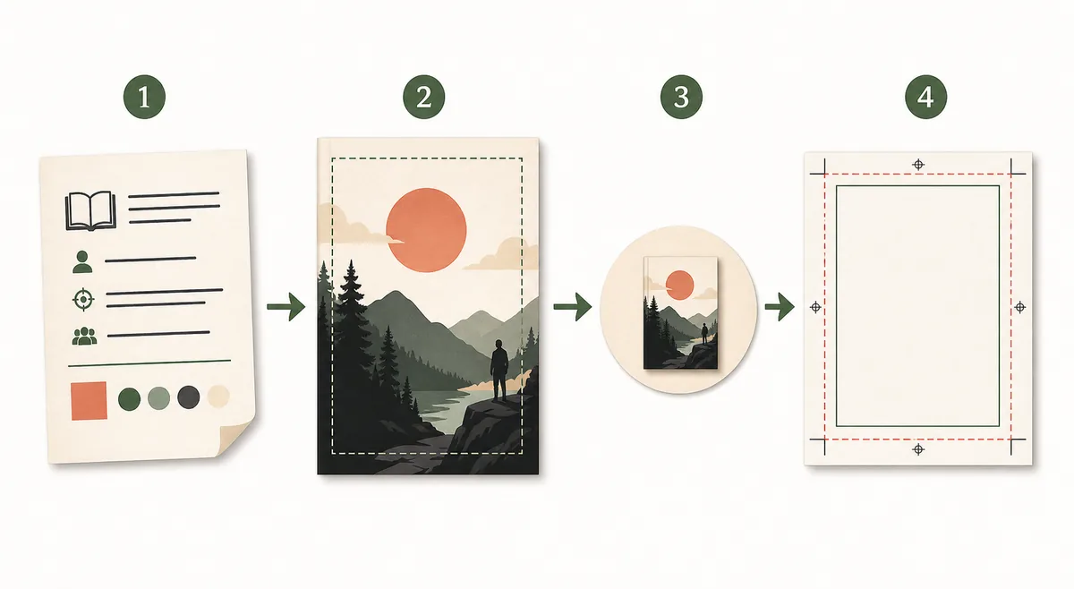
A six-step path from book brief to usable cover
Use Canva for the visual work, but keep the publishing decision visible at every step. The goal is not to fill a template; it is to create a cover that can be understood, reviewed, and exported without a late rebuild.
| Step | What to do in Canva | What to check | Useful output |
|---|---|---|---|
| 1. Write the brief | Record the genre, reader, title, author name, mood, and sales channel before opening a template. | The brief names one reader promise instead of a list of unrelated scenes. | A short creative direction you can compare against every design choice. |
| 2. Choose the canvas | Start with a portrait canvas that matches the immediate format. Do not use an eBook canvas as a print wrap by accident. | The pixel size, aspect ratio, and intended export are written down. | A correctly oriented working file with room for the composition. |
| 3. Build one focal point | Place one subject, symbol, landscape, or texture and leave negative space around the title zone. | The eye finds a first subject without needing explanatory text. | A readable image direction that still works before typography is added. |
| 4. Add the hierarchy | Set the title first, then author, series, subtitle, and any small supporting copy. Use contrast and spacing before extra effects. | The title is readable at a small size and the author name is not competing with it. | A cover whose type communicates genre and importance in the right order. |
| 5. Review the thumbnail | Export or preview a small copy and inspect it beside other covers in a realistic listing view. | The title, focal point, contrast, and genre cue survive reduction. | A short list of changes based on how a reader actually sees the cover. |
| 6. Prepare the file | Export the format you need, then compare the result with the current platform rules and template. | Bleed, safe area, spine, barcode space, resolution, and file type match the final use. | A publishable front cover or a production-ready starting file. |
Do not confuse an eBook cover with a print wrap
Canva can help with both digital and print artwork, but the file logic is different. An eBook usually needs one tall front cover. A paperback or hardcover needs a coordinated spread with a back panel, spine, bleed, trim, safe areas, and sometimes barcode space. If you change format late, the artwork may need a new crop and a new text layout.
eBook front cover
Keep the composition vertical, make the title legible on a small screen, and remove spine or back-cover copy that belongs to a print file.
Paperback full wrap
Plan the back, spine, front, bleed, trim, safe areas, and barcode treatment as one system. A front-only design is not a finished paperback file.
Hardcover setup
Use the exact hardcover template for the platform and binding. Do not reuse paperback measurements simply because the visual style is similar.
Final export
Check the current official requirements for dimensions, resolution, color, file format, bleed, and upload limits before calling the file finished.
Make the title and genre signal arrive in the right order
A book cover is a small piece of communication. Readers often see it beside dozens of alternatives, so the design needs a predictable reading order before it needs extra decoration.
Genre and promise
Use the image, color temperature, and visual metaphor to tell the right reader what kind of experience or result the book offers.
Title first
Give the title the clearest contrast and the most stable zone. Long titles need fewer competing elements, not smaller type everywhere.
Author and series
Place the author name and series cue consistently. Keep them subordinate unless the author is already the strongest sales signal.
Image and type balance
Do not let a busy image fight the title. Crop, blur, darken, or simplify the background before adding more text effects.
How to build the cover in Canva without redoing it later
Work in a deliberate order. Each stage answers a different question, and finishing one question before starting the next keeps the file easier to review.
Start from the reader
Write a one-sentence promise and list two or three comparable books. Note the genre cues you want to meet and the visual clichés you want to avoid.
Choose one composition
Pick a focal subject, a quiet title zone, and a color direction. If the cover needs five explanations, the composition is probably doing too much.
Set typography early
Test the title, author, and subtitle before polishing the illustration. Pair readable fonts, keep line spacing intentional, and check contrast against the actual background.
Review at two sizes
Inspect the design at full working size for alignment and at thumbnail size for recognition. A cover must pass both views, not only the zoomed-in artboard.
Export with a purpose
Save a clean front-cover file for digital use and a separate production file for print when needed. Keep the editable source so later format changes do not start from zero.
Fix these problems before you export
Most cover problems are visible before upload. A short review is cheaper than discovering that a title is clipped, a genre cue is unclear, or a print file cannot become a full wrap.
| Mistake | Why it fails | Better fix |
|---|---|---|
| Starting with a pretty template | A template can determine the composition before you know the reader, genre, title length, or final format. | Write the brief first, then choose a layout that serves the book instead of forcing the book into the layout. |
| Putting the title over busy detail | Texture and high-frequency imagery reduce contrast, especially when the cover becomes a small thumbnail. | Create a quiet title zone, crop the focal image, and remove detail before adding more outlines or shadows. |
| Using one canvas for every format | An eBook front cover and a paperback wrap have different panels, measurements, and production risks. | Keep the visual direction consistent but create separate front-cover and full-wrap files from the right template. |
| Checking only the desktop artboard | A design can look polished at 100 percent and become unreadable in a store listing or mobile search result. | Review a realistic thumbnail and compare the title, author, focal point, and genre cue at that size. |
| Treating Canva export as the final proof | Exporting a file does not confirm current KDP dimensions, bleed, spine width, barcode clearance, or upload rules. | Compare the exported file with the official platform guidance and template, then keep a separate editable source. |
Choose the next page based on the problem you still have
Canva is one part of a cover workflow. Use the resource that matches the next decision instead of adding more decoration to the same file.
Design a cover for free
Follow a no-subscription route from brief to thumbnail review, then check the final format before export.
Open the free guideFind a visual direction
Compare genre signals, focal points, color ideas, and thumbnail-safe concepts before you start the artwork.
Explore design ideasPlan the full layout
Learn how front, spine, back, bleed, trim, safe areas, and hierarchy fit together in a print cover.
Review cover layoutRefine cover fonts
Choose readable, genre-aware type pairings after the title zone and visual hierarchy are clear.
Review cover fontsGenerate a first direction
If you prefer to start from a prompt instead of a blank canvas, create a visual draft and refine the type later.
Open the AI generatorCheck print dimensions
Use trim size, page count, paper, and binding to plan a KDP paperback or hardcover wrap.
Check KDP dimensionsCreate a production scaffold
Generate a front, spine, back, bleed, safe-zone, and barcode-space template before final export.
Generate a templateCheck official rules before the final upload
Design choices are creative, but platform specifications can change. Use the current official guidance for the format you are actually publishing.
How to Design a Book Cover on Canva FAQ
Turn the cover plan into a stronger first draft
Start with a clear genre promise, test the title at thumbnail size, and use the right production tool before you publish.